Imagine a world without colors! How can it be? We can somehow resemble it with the Antarctica continent but even Anterctica isn’t totally colorless either. It has some bluish effect all over the place there and It feels so lifeless there. But If we consider other zones all the colors give life to nature. Indeed Color is one of the greatest gifts of nature.
We get it from nature that not every color goes with everything. Some colors give us warm feelings like- yellow, red, orange and pink, they can motivate and energize us. However, if they’re too intense, they can also be irritating. Cool colors, such as green, blue, and violet can have a calming effect on us.
“Color is a powerful physical, biological and psychological force” – John Paul
As we were talking about the color psychology in branding, it can’t be imaginable without colors also. As Up to 90% of an initial impression comes from color so it’s very significant to use the right colors for your branding to have the right message for your audiences.
Colors can also increase our visual memory and our arousal level. Research suggests that physiological arousal was higher during the viewing of the color red than it was for green (Wilson,1966). Other research suggests that the effect of emotion on memory depends on the color type (Kuhbander & Pekrun, 2013). And do you know that, 93% of consumers make purchasing decisions based on visuals alone!
1. Creates emotion into audience mind
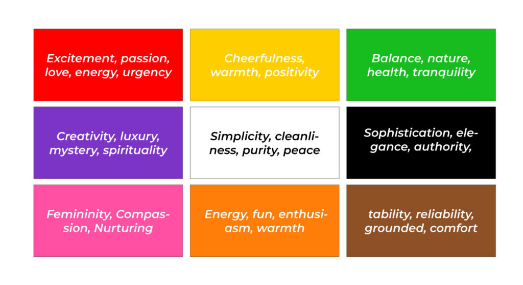
As every brand perceives a story, in the story colors can create its magic creating emotions and influencing how audiences will perceive a brand. Different colors evoke distinct psychological and emotional responses, which marketers and designers often use to create a connection with their audience. Here’s how different colors can affect emotions:

Like, non-profit organizations often use colors like blue and green to evoke feelings of trust, compassion and hope, which encourages people to support their causes.
2. Reveals brand personality
Color is a fundamental tool in revealing a brand’s personality because it is the visual aesthetics of a brand that help audiences instantly perceive the essence of a brand. Colors help express a brand’s personality, whether it’s sophisticated, playful, or professional. The color choices for logos, packaging and marketing materials communicate these traits to customers subconsciously.
Such as – Luxury brands like Chanel and Gucci often use black to signify elegance and exclusivity in their branding.
3. Brand Recognition
Color Color psychology plays a major role in how consumers make decisions and evaluate brands. Research shows that- Color can increase brand awareness and recognition by 80%. When a brand continuously uses a specific color scheme, it becomes easier for consumers to identify and recall the brand.

Such as- Coca-Cola have successfully established strong brand associations with their colors. We can assume the brand without their logo. They did their branding so well that by their any kind of presence we can recognize them instantly.
4. Purchasing Decisions
Studies reveal that up to 90% of the audience judge brand products by its color. Consumers often associate colors with specific qualities like reliability, excitement, fun or luxury, which can directly impact their purchasing behavior. So, Brands need to initiate smart strategies to convince their consumers.
Like, Orange creates such a happy, fun mood into consumers that’s what you can see in Fanta branding. They impel their consumers with a sunny, fun branding of theirs.
5. Brand Loyalty
Consistent use of color helps build brand loyalty by creating a recognizable and reliable image in the consumer’s mind very subconsciously. When consumers repeatedly encounter the same color in a brand’s marketing and products, it fosters familiarity and trust. It’s human nature. Like if we listen to music continuously, we can memorize it automatically though it’s not intended.
For example, Starbucks consistently uses green in its branding, which is associated with nature, tranquility and sustainability, aligning with its commitment to ethical sourcing and environmental responsibility.
6. Color Difference According to Gender
Research shows that color preferences can differ by gender. While men tend to prefer blue, green or black on the other hand women are more inclined toward purple, pink, and soft shades. It’s quite natural for different genders which provokes them to go through different choices. So while branding color should be picked based on the target audience.
For example, many beauty brands like sanitary napkin brand- Senora, Stayfree targeting women using softer hues like pink and purple, while outdoor or sports brands like- Nike targeting men often using darker, more neutral tones like blue and black.
7. Color and Readability

Contrast between colors plays a significant role in readability and this thing highlights the text in a beautiful manner. A brand’s choice of background and text colors can present its message very easily to its audience.
High contrast combinations like black text on a white background improve readability, while low contrast combinations may cause strain or make content difficult to read.
8. Perceived Value of Products
The color of a product or its packaging can influence consumer’s perceptions of its quality and price. Color combinations are different for modern, bold, fun, classical, luxurious and mature kinds of brands.
While high-end brands often use muted, luxurious colors like black, gold or silver to imply exclusivity and premium quality, on the other hand corporate brands use bold colors like blue, black or violet.
9. Color Preferences Vary with Age
Age is also a very significant issue in branding. Not every age prefers the same color combo. It can influence how people perceive and prefer colors. Younger audiences tend to be drawn to brighter and more vibrant colors, while older demographics may prefer more muted, classic tones.
Brands targeting children often use bright, primary colors appealing to their playful and energetic nature, while brands aimed at older adults might use mature colors like navy, beige or gray.
10. Cultural and other Influences
Cultural differences can have different emotional responses. For example, in some cultures, white is associated with purity, while in others, it represents mourning.
High contrast colors can draw attention and highlight important elements, while softer palettes may evoke relaxation.
Complementary colors can create balance, while clashing colors can provoke tension or unease which can be used intentionally to create dramatic effects.
Today’s marketing language is different from previous. They use different elements provoking their audience not only with the logo but also with colors, patterns or other graphic elements. So, to make your brand work in the long run, color can be a non-negotiable element for your branding.

